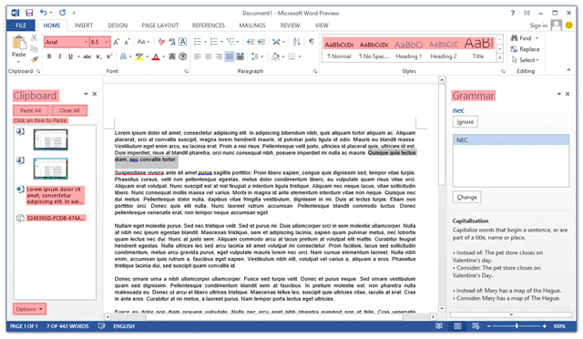
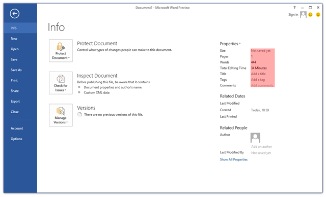
Poking around the Office 2013 Customer Preview, one thing that caught my eye immediately was the lack of ClearType font smoothing. Nearly all user interface elements use ‘greyscale’ font smoothing (as opposed to ClearType’s sub-pixel smoothing). I’ve highlighted the parts of Word 2013 that still use ClearType:
The text in cells in Excel 2013 still respects the system’s ClearType setting, and Outlook 2013 is a real mess (about half-and-half). OneNote 2013 seems to have retained ClearType in most places (outside the ribbon control).
Long Zheng earlier noted the absence of ClearType from the Metro environment and there are several possible reasons for it falling out of favour at Microsoft. Sub-pixel anti-aliasing isn’t necessarily suited to tablets that need to support multiple orientations (unless different sub-pixel orderings are taken into account), and screens with high pixel densities can get away with greyscale font smoothing.
I fear that this is another case of the tablet tail wagging the Microsoft dog – desktop and laptop users of Office 2013 (and Metro-style apps in Windows 8) will have to deal with lower quality text due to the new hardware Microsoft is targeting with its upcoming releases.
The Office 2013 Customer Preview is, of course, just that, and things might change before RTM. Regrettably this wasn’t fixed for the Office 2013 RTM.


Why can’t the app be smart enough to determine if it’s running on a tablet or desktop/laptop and automatically switch between subpixel anti-aliasing and greyscale anti-aliasing? IE10 has the same problem.
I uninstalled Office 2013 after noticing how bad the text looked. I can’t believe they aren’t supporting ClearType on desktop environments.
Unbelievable! I hate 0ffice 2013 now.
I had the same problem, but it is now fixed somehow.
I fumbled with the Word settings and restarted it a few times, but I think what fixed it was re-enabling cleartype on Windows 8. It was already enabled, but I think that was what fixed it.
Before that, it was painful to look at documents. I now do not have that problem.
I am sorry I can’t tell for sure what fixed it.
Good luck.
Can you upload a screenshot of Microsoft Word running on your PC? I think it’s very unlikely that the text is actually being rendered with ClearType font smoothing, but I’d love to be proved wrong.
I disabled and re-enabled cleartype and to my eye it made a slight improvement. It still looks obviously worse than office 2010 but a bit more readable. I can upload a screenshot but I don’t know how to on your site.
Office 2013 is a worthless pile of garbage without ClearType. I text looks like a 800×480 pixelated monitor from 1999. DO NOT BUY OFFICE 2013.
Microsoft are making decisions that would make EA think twice. This company is truly leaderless and clearly out of touch.
And the fix is:
1. In Word, go to File then Options
2. In Options, select Advanced
3. Scroll down to Display
4. Under Display, deselect: Use subpixel positioning to smooth fonts on screen
And wha-la Clear Type displays as Clear Type. (This has been driving me nuts for about 2 months! )
While this setting does affect the rendering of fonts in Office 2013, turning it off doesn’t cause ClearType font smoothing to be enabled. I’m happy to be proved wrong, though – take a screenshot of your machine, put it on imgur and share it here.
In word 2013, the suggested “fix” does nothing. The on screen font rendering is scary bad. I have both word 2013 and 2010 running and if you see the side by side it is very noticeable. Then if take the magnifier tool, which blows it up (but does not re-render) it REALLY shows how bad 2013 does this. I get the tablet thing (I also have a surface pro) but for desktops, Word 2013 is now UNUSABLE.
I just ran into this as well and am amazed how bad the fonts look when I ctrl-mousewheel to zoom in when composing an email.
What the heck is Microsoft thinking!
Really? I think it looks good when zooming, but once the zooming is done it goes awful again.
Office 2016 still has the same issues. The font rendering is awful in Word and Outlook. Strangely, OneNote and Excel look much better.